
How to use the shadcn/ui create plugin with the shadcn/ui Figma library
This plugin is built to work hand‑in‑hand with this shadcn/ui Figma component library.Think of it as a control panel for the system: you make changes in the plugin, and the library updates itself.
You don’t edit variables manually, and you don’t have to touch individual components unless you really want to.
What the plugin is for
Use the plugin when you want to make global changes without breaking anything:
- Switch between light and dark modes
- Update themes across the entire file
- Change font scales globally
- Swap icon sets (Lucide, Tabler, HugeIcons)
- Adjust component radiuses
- Keep everything in sync with shadcn/ui
All of this happens through Figma variables, not one‑off hacks.
Best order to work in
If you’re not sure where to start, this order usually feels the calmest:
- Pick your theme + mode (light / dark).
- Set your typography (font + scale).
- Choose your icon set.
- Tweak radius last to get the right shape language.
That way, you lock in the “big” decisions first, then fine‑tune the feel.
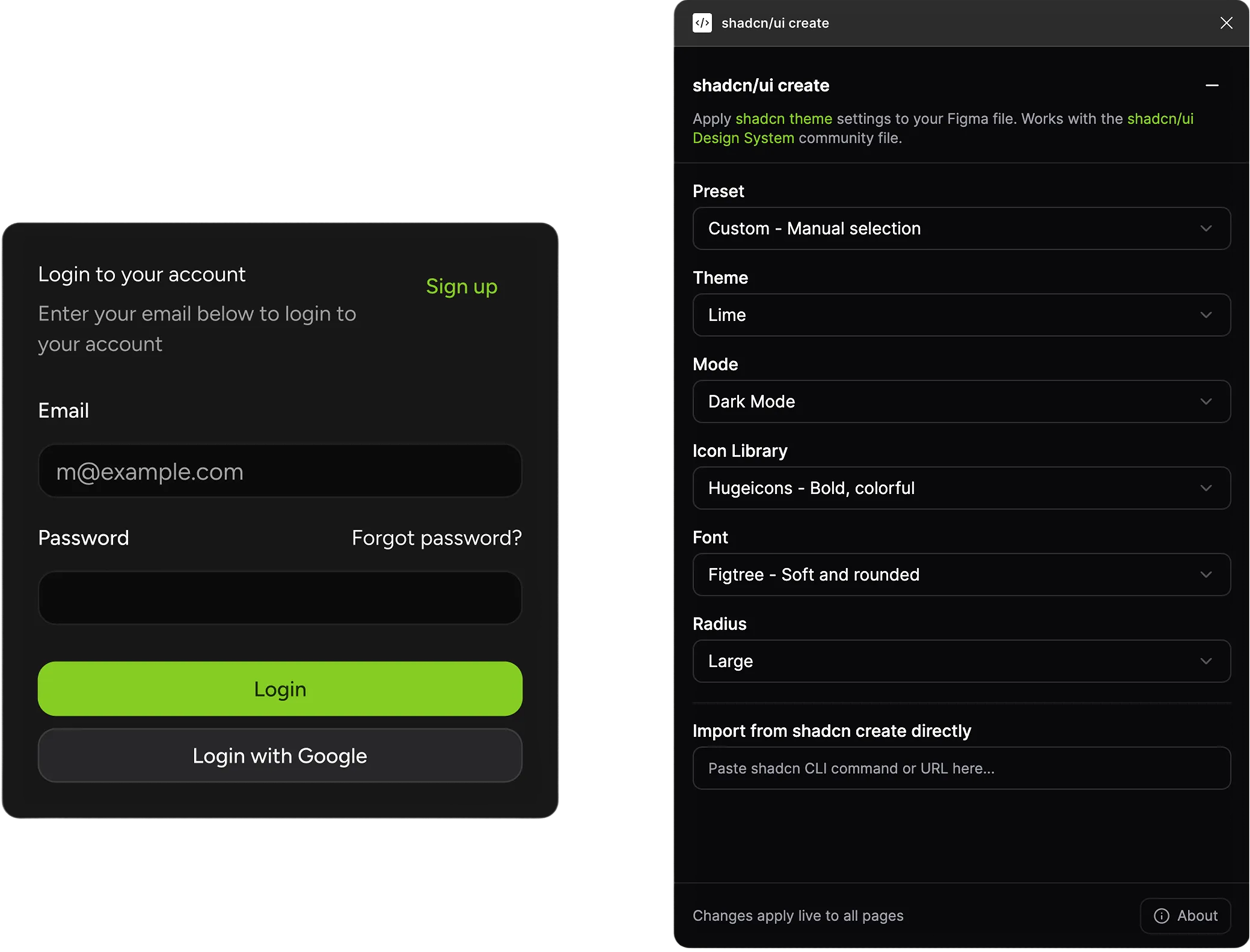
How it works (quick overview)
- Open the shadcn/ui Figma library file.
- Run the Shadcn/UI Create plugin.
- Choose what you want to update:
- Theme / colors
- Typography
- Radius
- Icons
- Click apply → the file updates instantly.
Every component that’s wired to those variables reacts automatically.
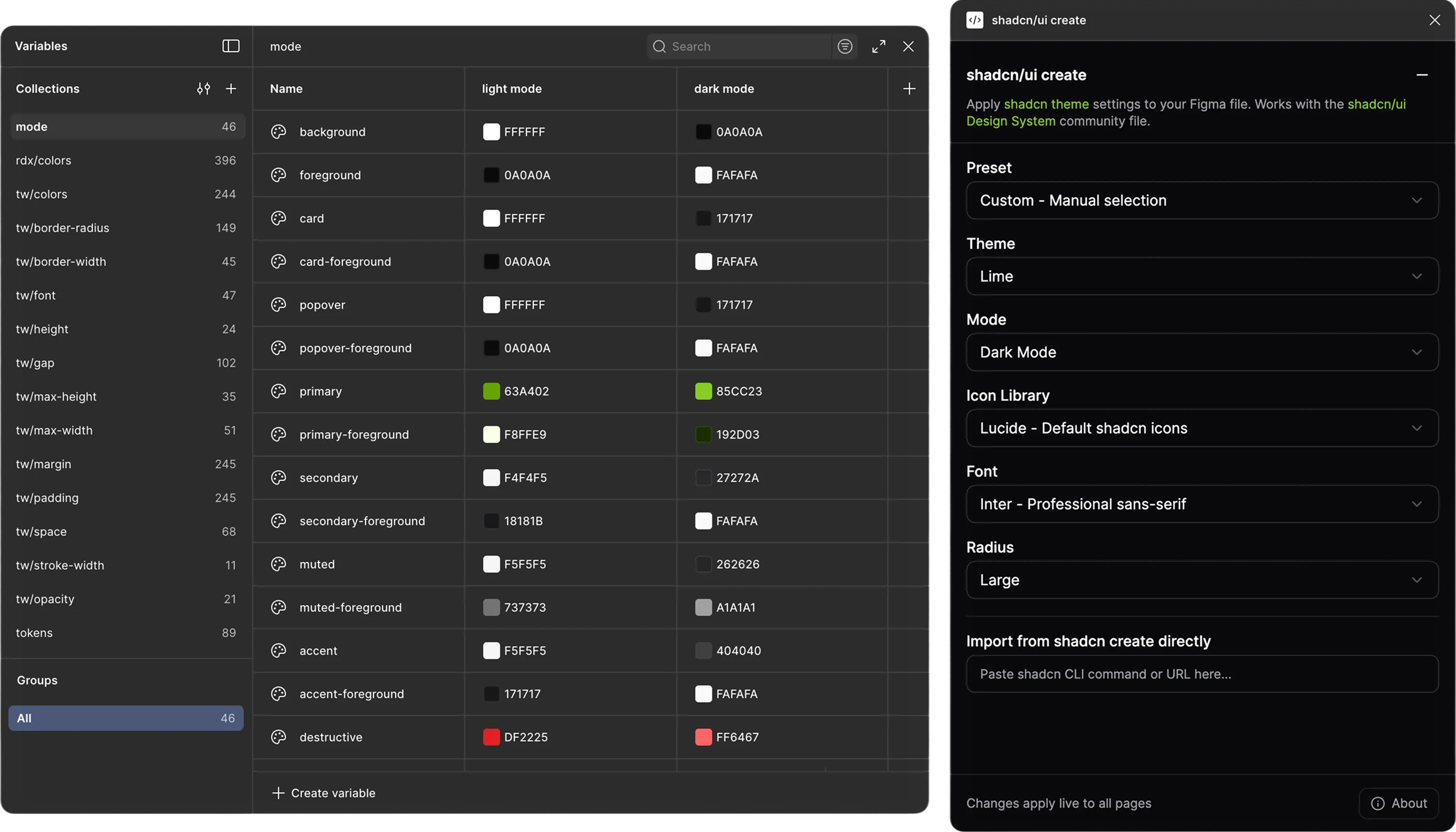
Where changes are applied (mode category only)
The plugin only edits values inside the existing variable modes category in this file.
- All the styles used in components (colors, type, radius, etc.) live in those modes.
- When you change something in the plugin, it updates the values in the mode column (for example: Light / Dark), not the components directly.
- You can open the Variables panel in Figma at any time and see exactly what changed, nothing is hidden or stored somewhere else.
That’s why the system stays predictable: the plugin respects the structure of the variables you already see.
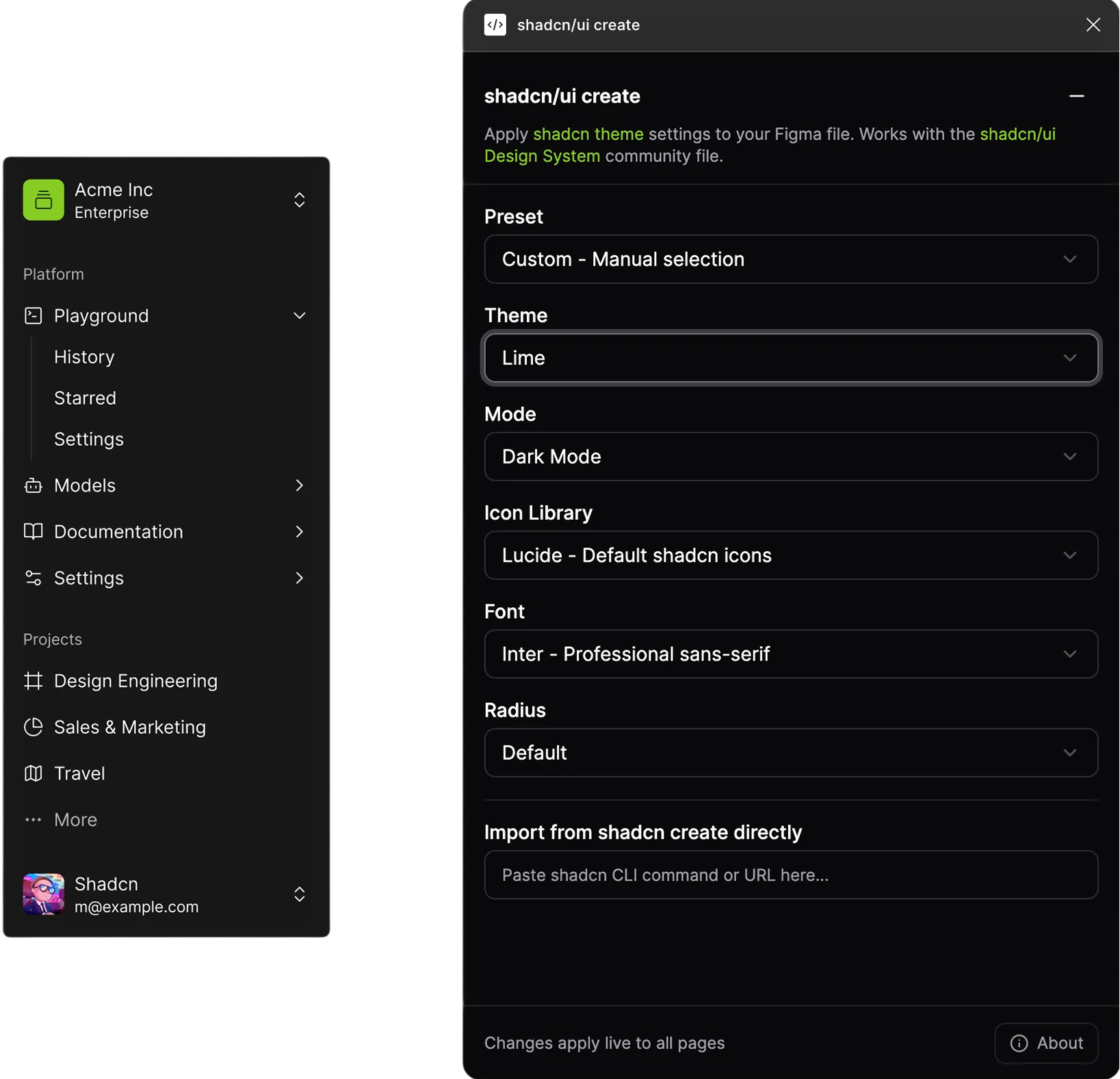
Themes
Use this when you want to switch the overall theme or tweak color palettes.
- Open the plugin and go to Theme.
- Pick the theme you want to use.
- Click apply.
The plugin updates the color variables in the right mode, and the entire file (components, tokens, layouts) follows along.
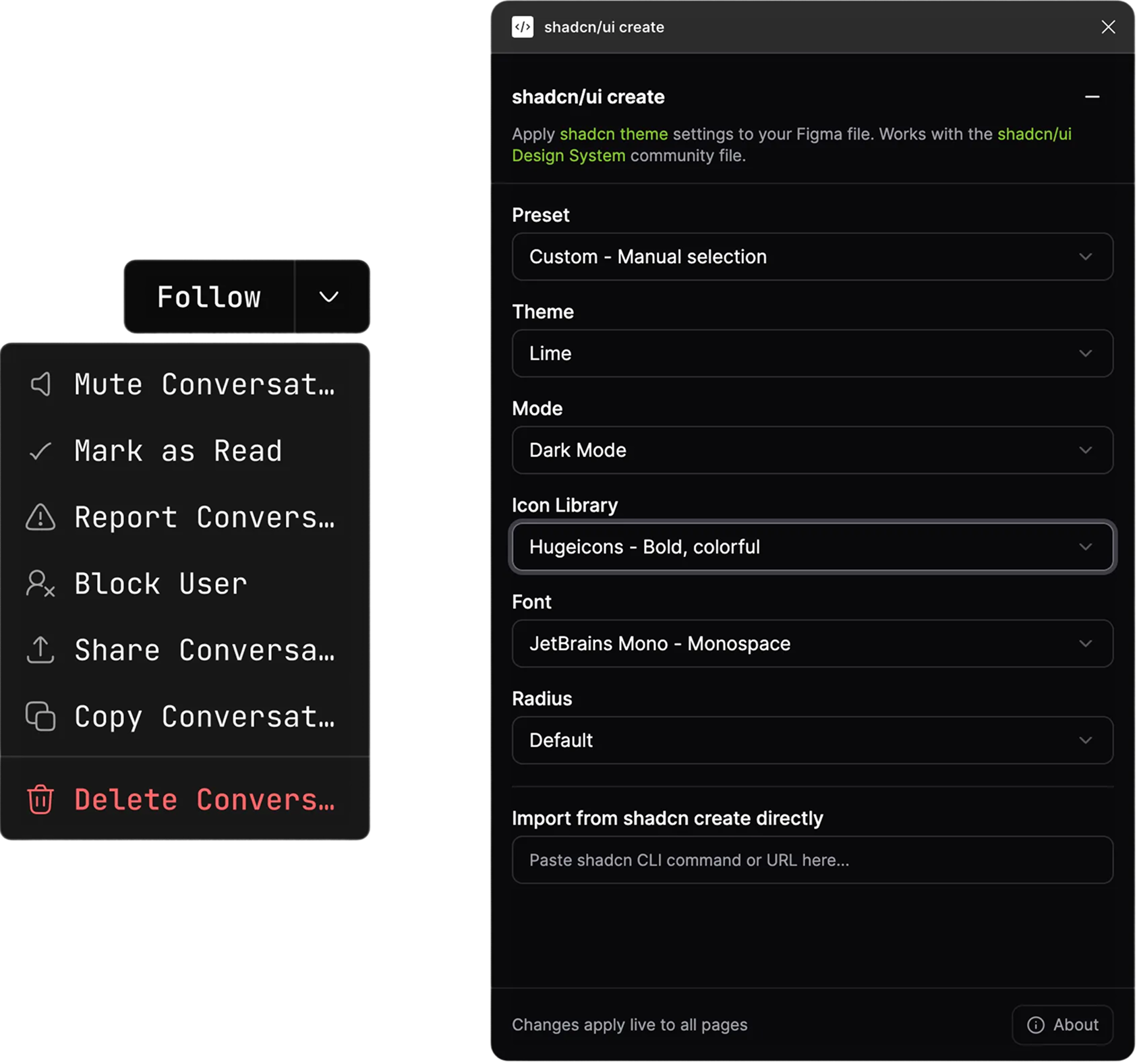
Icons
Use this when you want to switch icon sets without manually swapping every icon.
- Open the Icons section.
- Choose between Lucide, Tabler, HugeIcons (or others you’ve wired).
- Apply.
The plugin uses its internal icon mapping so components keep working, no detached icons, no weird misalignments.
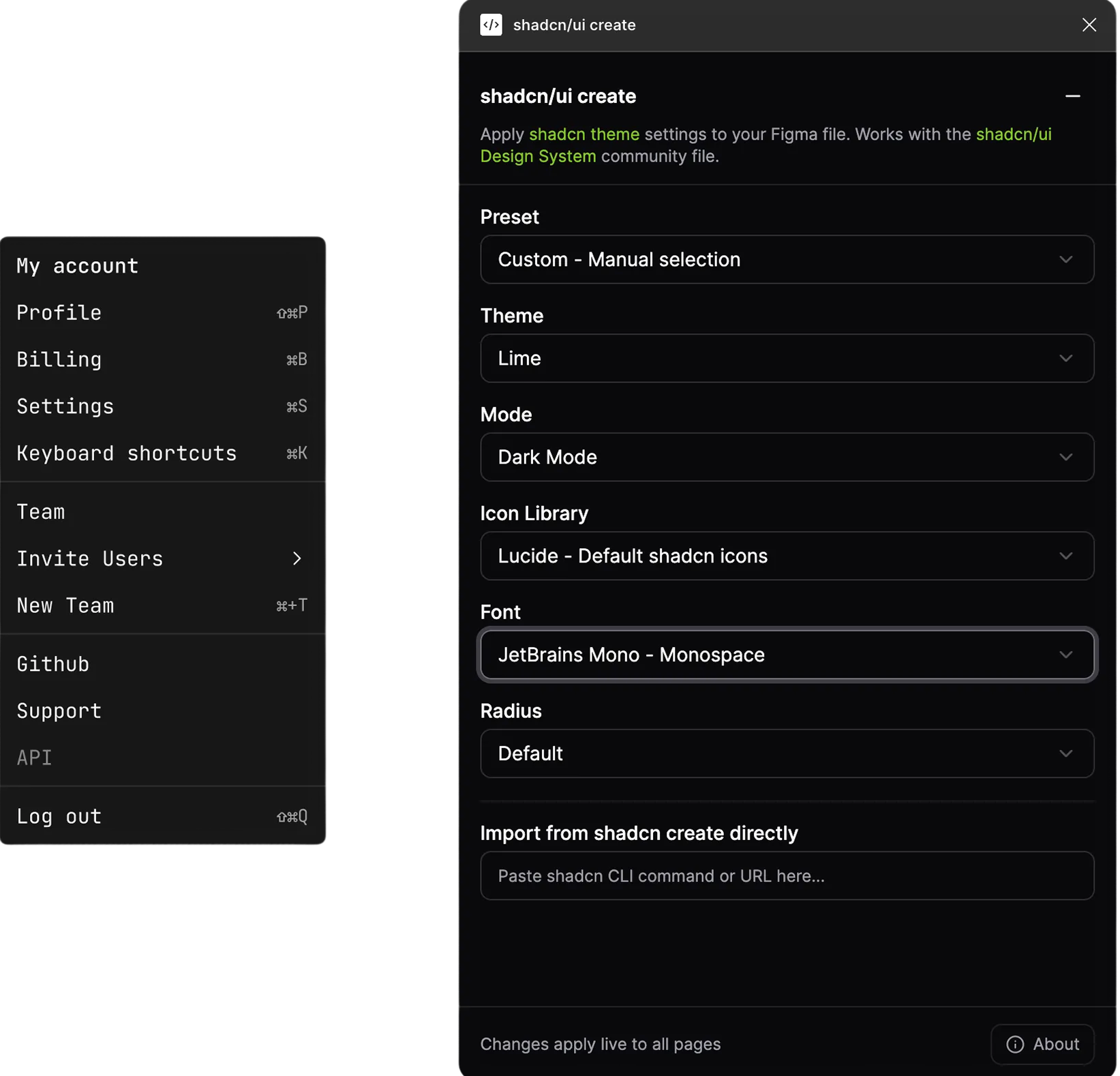
Fonts
Use this when you want to try a different font.
- Go to the Font section in the plugin.
- Choose your font and scale.
- Apply changes.
Text styles and components update through their variables, so you don’t have to manually edit headings, buttons, inputs, etc.
Radius
Use this when you want to change the border radius of the whole system.
- Open the Radius section.
- Pick the radius you want (sharper or more rounded).
- Apply.
Buttons, cards, inputs, and other components update together, since they share the same radius variables.
When to edit variables manually
Manual edits are for more advanced or experimental tweaks.
- If you do edit variables by hand, try to stay inside the existing modes instead of creating random new ones.
- Keep the structure (naming, groups, modes) intact so the plugin still understands how everything fits together.
Buttons, cards, inputs, and other components update together, since they share the same radius variables.
About customizing and changing components
The plugin is built to work with the original structure and naming inside this library but that doesn't mean you can't make it your own.
You can absolutely customize components:
- Modify layouts, spacing, and visual details
- Adjust individual components to fit your needs
- Build on top of the existing foundation
Just keep in mind:
- The plugin updates components through their connected variables (colors, typography, radius, icons).
- As long as those variable connections stay intact, the plugin will keep working.
- If you completely restructure them or add new variables, the plugin may not automatically find and update those specific pieces anymore.
For the best of both worlds:
- Keep the variable connections intact on components you want the plugin to update automatically.
- Feel free to customize everything else: appearance, layout.
The library is yours to adapt. The plugin is just there to make global updates faster when you need them.
Troubleshooting checklist
If something feels off, try this:
- Components not updating?
- Make sure you’re in the original library file, not a random duplicate.
- Check that you’re using the latest version of the library.
- Confirm that key variables still exist and haven’t been deleted or renamed.
- Theme/font/icon change looks weird?
- Open the Variables panel and verify the modes and values.
- Use version history to roll back to a previous state if needed.
Most issues come from renamed components, deleted variables, or very old copies of the file.
FAQ
Try the plugin
Give it a try and play around. And if you’ve any feedback or discover bugs, do let me know.


figma

Buy me a coffee