@shadcn/ui component library in Figma

24.7k users

2k

39

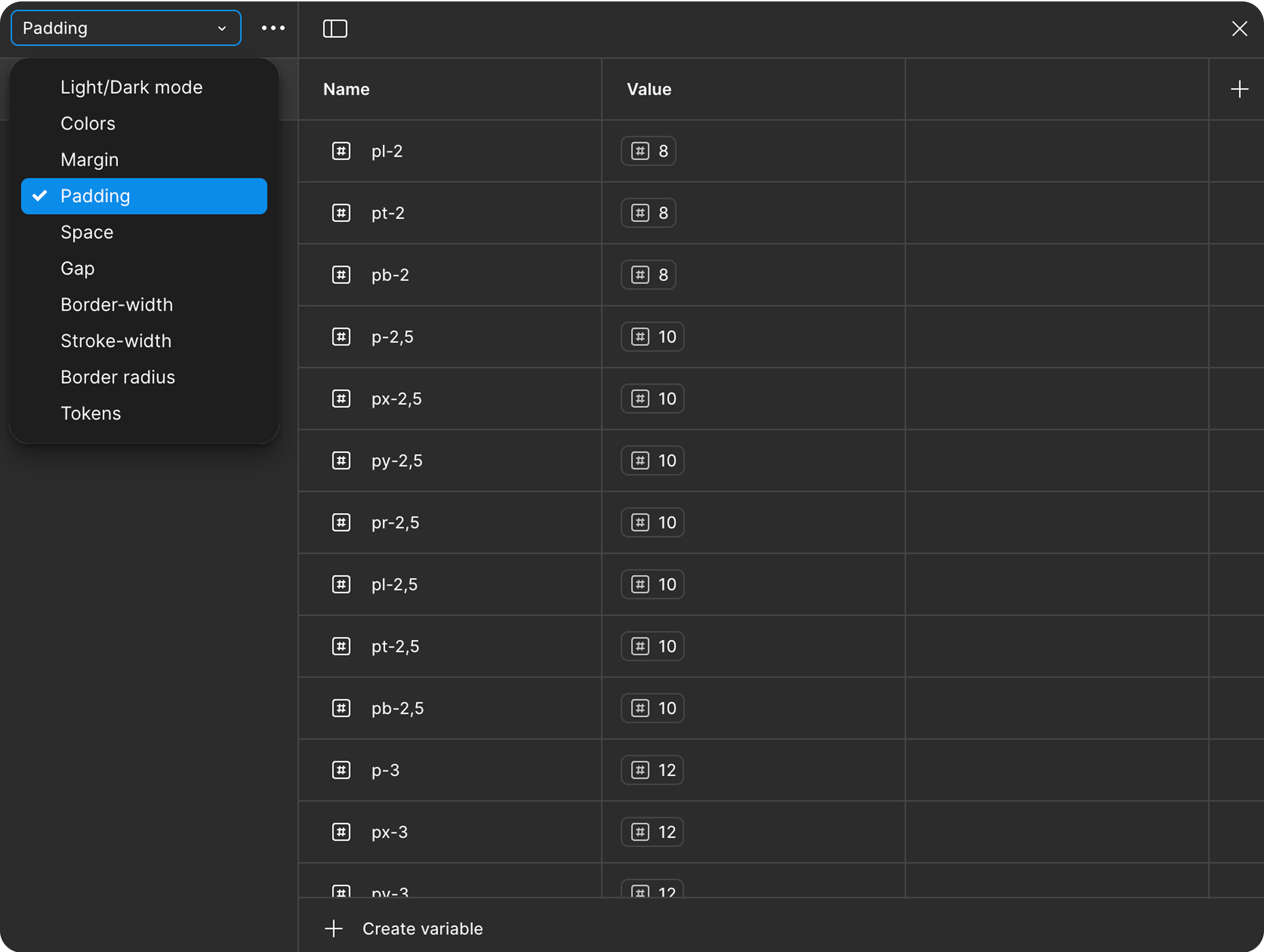
I’ve always loved how clean and flexible the Shadcn/ui components are — which is why I set out to recreate the Shadcn component library in Figma. I wanted to design with the same system developers were already using. No more guessing paddings, rebuilding buttons, or hacking together drop-down.
What started as a small workflow improvement quickly turned into something bigger. I’ve been genuinely blown away by how many people have found it helpful — from solo makers to design teams trying to stay in sync with developers. Whether it’s for faster wire-framing, smoother handoffs, or just staying consistent, it’s been amazing to see the library used in real projects.
I truly appreciate every kind word, download, and bit of feedback — it’s a reminder that even small tools can make a real difference in everyday work.
If you'd like to get notified when I add new components or update the library, just drop your email and I’ll send you a quick message.
I stayed as close to the original as possible — using variables, auto layout, and component props — so designers can confidently work on the same foundation as their dev teammates.